Welcome to the TacoTime Canada Brand Hub, showcasing guidelines designed to provide a framework for effectively representing our brand identity. These guidelines ensure consistency and coherence across all brand touchpoints, enabling us to communicate our values, personality, and unique offerings.
The primary logo consists of two elements: a wordmark and a symbol. These two components are often placed in a fixed relationship and should not be altered, modified, separated, or redesigned in any way.
TacoTime also uses a brand mark, in leu of the full primary logo. This cactus icon is used in instances where the full logo cannot fit, or if there is already brand continuity (such as a store location store or digital app). There are two different variations of the cactus logo to use, and should not be altered, modified, or redesigned in any way.
TacoTime also uses a brand mark, in leu of the full primary logo. This cactus icon is used in instances where the full logo cannot fit, or if there is already brand continuity (such as a store location store or digital app).
There are two different variations of the cactus logo to use, and should not be altered, modified, or redesigned in any way.
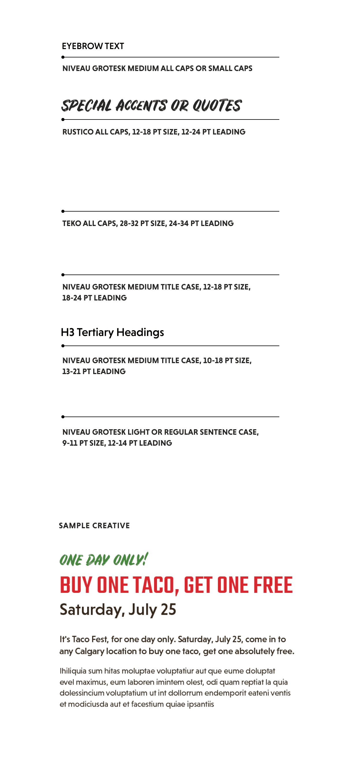
Our primary font families are used for our internal and external official communications, promotions, and marketing materials. Rustico should be used sparingly for highlight text while TEKO is used as our primary header font. Niveau Grotesk is used for all body copy. Commitment to these typefaces and how they are used will create a consistent, strong identity.
Visual Hierarchy
Always remember, if every element appears important, nothing will seem important. A balance of contrasting text sizes, restrained highlights of colour, and the right amount of leading (space between the lines) is key to successful visual hierarchy in every instance.
Leading (Line Spacing)
Maintain a line spacing of 1.5 times the font size for body text to ensure readability and a clean appearance.
Headings Alignment
Keep things Left-aligned or center-aligned, depending on the layout. Consistency in your alignment should be maintained within the same document or design.
Body Text Alignment
Always left-aligned for readability. Avoid justified text to prevent uneven spacing and maintain a clean appearance.
Lists and Bullets
Always left-aligned with consistent indentation.
Clearspace
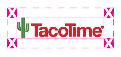
When applying the brand, always ensure there is clear space (the minimum amount of breathing room) is maintained around the full logo. This ‘X’ defines the minimum distance between the logo and the edge of a printed piece, or other design/copy elements around it.
Improper Use
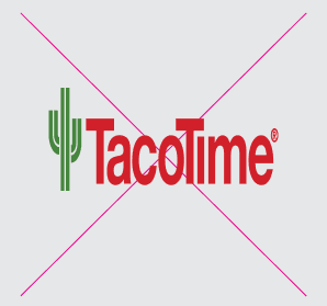
1. Do not stretch or skew the logo and make sure only brand colours are used.
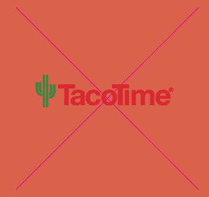
2. Do not use logo variations that don’t provide enough contrast for the logo.
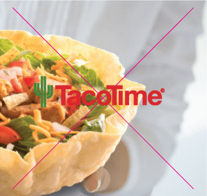
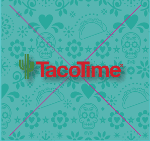
3. Do not use the logo over an image that doesn’t provide enough legibility for the logo.
4. Do not use drop shadows on the logos.
1.
2.
3.
4.
BRAND ELEMENTS
Taco Tuesday & Burritoful Thursday Promo badges
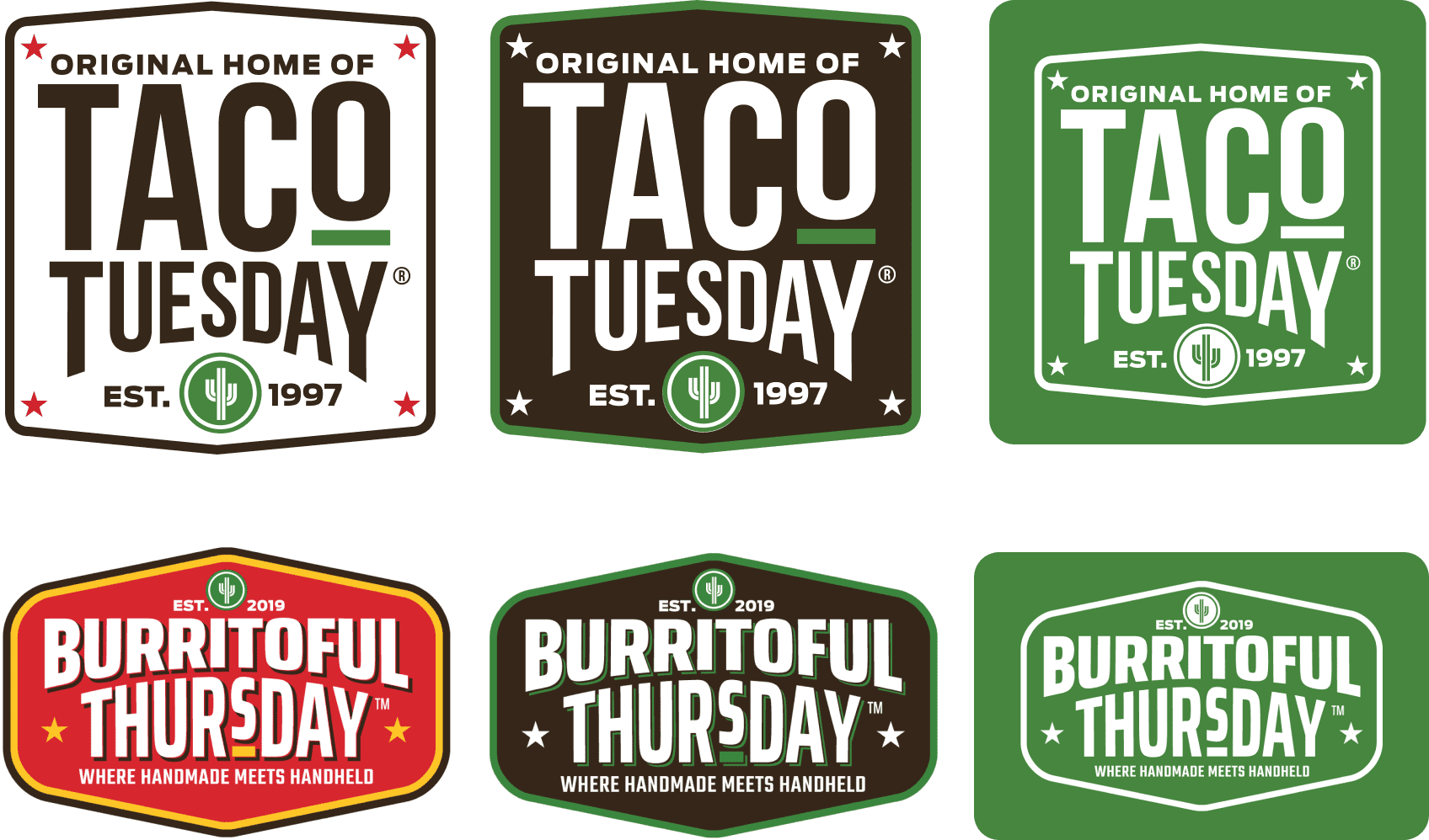
Badges used for Taco Tuesday and Burritoful Thursday promotions.
Patterns & Textures
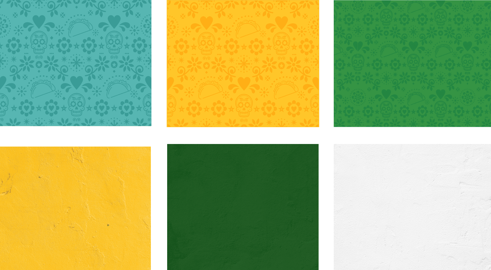
Evergreen patterns can be used for repeating wallpapers, vinyl wall features or local store marketing materials. There are also some textures available for a departure from flat colour. Ensure that your creations are not to busy, legible and placed carefully.
Food icons can be used in addition to brand elements. These icons should only be used in their outlined version to keep the TacoTime brand consistent, the exception being merch that has been approved by a designated brand specialist from the TacoTime Canada marketing group.
TacoTime Canada uses vibrant and engaging wallpaper and graphics to bring the right brand tone to your store. The Sugar Skulls and Stars should be used sparingly for special locations, occasions or seasons.
If you require a specific size that isn’t already in the package, please reach out to the TacoTime Canada marketing team.
Welcome to the TacoTime Canada Brand Hub, showcasing guidelines designed to provide a framework for effectively representing our brand identity. These guidelines ensure consistency and coherence across all brand touchpoints, enabling us to communicate our values, personality, and unique offerings.
The primary logo consists of two elements: a wordmark and a symbol. These two components are often placed in a fixed relationship and should not be altered, modified, separated, or redesigned in any way.
TacoTime also uses a brand mark, in leu of the full primary logo. This cactus icon is used in instances where the full logo cannot fit, or if there is already brand continuity (such as a store location store or digital app). There are two different variations of the cactus logo to use, and should not be altered, modified, or redesigned in any way.
TacoTime also uses a brand mark, in leu of the full primary logo. This cactus icon is used in instances where the full logo cannot fit, or if there is already brand continuity (such as a store location store or digital app).
There are two different variations of the cactus logo to use, and should not be altered, modified, or redesigned in any way.
Our primary font families are used for our internal and external official communications, promotions, and marketing materials. Rustico should be used sparingly for highlight text while TEKO is used as our primary header font. Niveau Grotesk is used for all body copy. Commitment to these typefaces and how they are used will create a consistent, strong identity.
Visual Hierarchy
Always remember, if every element appears important, nothing will seem important. A balance of contrasting text sizes, restrained highlights of colour, and the right amount of leading (space between the lines) is key to successful visual hierarchy in every instance.
Leading (Line Spacing)
Maintain a line spacing of 1.5 times the font size for body text to ensure readability and a clean appearance.
Headings Alignment
Keep things Left-aligned or center-aligned, depending on the layout. Consistency in your alignment should be maintained within the same document or design.
Body Text Alignment
Always left-aligned for readability. Avoid justified text to prevent uneven spacing and maintain a clean appearance.
Lists and Bullets
Always left-aligned with consistent indentation.
Clearspace
When applying the brand, always ensure there is clear space (the minimum amount of breathing room) is maintained around the full logo. This ‘X’ defines the minimum distance between the logo and the edge of a printed piece, or other design/copy elements around it.
Improper Use
1. Do not stretch or skew the logo and make sure only brand colours are used.
2. Do not use logo variations that don’t provide enough contrast for the logo.
3. Do not use the logo over an image that doesn’t provide enough legibility for the logo.
4. Do not use drop shadows on the logos.
1.
2.
3.
4.
BRAND ELEMENTS
Taco Tuesday & Burritoful Thursday Promo badges
Badges used for Taco Tuesday and Burritoful Thursday promotions.
Patterns & Textures
Evergreen patterns can be used for repeating wallpapers, vinyl wall features or local store marketing materials. There are also some textures available for a departure from flat colour. Ensure that your creations are not to busy, legible and placed carefully.
Food icons can be used in addition to brand elements. These icons should only be used in their outlined version to keep the TacoTime brand consistent, the exception being merch that has been approved by a designated brand specialist from the TacoTime Canada marketing group.
TacoTime Canada uses vibrant and engaging wallpaper and graphics to bring the right brand tone to your store. The Sugar Skulls and Stars should be used sparingly for special locations, occasions or seasons.
If you require a specific size that isn’t already in the package, please reach out to the TacoTime Canada marketing team.
Welcome to the TacoTime Canada Brand Hub, showcasing guidelines designed to provide a framework for effectively representing our brand identity. These guidelines ensure consistency and coherence across all brand touchpoints, enabling us to communicate our values, personality, and unique offerings.
The primary logo consists of two elements: a wordmark and a symbol. These two components are often placed in a fixed relationship and should not be altered, modified, separated, or redesigned in any way.
TacoTime also uses a brand mark, in leu of the full primary logo. This cactus icon is used in instances where the full logo cannot fit, or if there is already brand continuity (such as a store location store or digital app). There are two different variations of the cactus logo to use, and should not be altered, modified, or redesigned in any way.
TacoTime also uses a brand mark, in leu of the full primary logo. This cactus icon is used in instances where the full logo cannot fit, or if there is already brand continuity (such as a store location store or digital app).
There are two different variations of the cactus logo to use, and should not be altered, modified, or redesigned in any way.
Our primary font families are used for our internal and external official communications, promotions, and marketing materials. Rustico should be used sparingly for highlight text while TEKO is used as our primary header font. Niveau Grotesk is used for all body copy. Commitment to these typefaces and how they are used will create a consistent, strong identity.
Visual Hierarchy
Always remember, if every element appears important, nothing will seem important. A balance of contrasting text sizes, restrained highlights of colour, and the right amount of leading (space between the lines) is key to successful visual hierarchy in every instance.
Leading (Line Spacing)
Maintain a line spacing of 1.5 times the font size for body text to ensure readability and a clean appearance.
Headings Alignment
Keep things Left-aligned or center-aligned, depending on the layout. Consistency in your alignment should be maintained within the same document or design.
Body Text Alignment
Always left-aligned for readability. Avoid justified text to prevent uneven spacing and maintain a clean appearance.
Lists and Bullets
Always left-aligned with consistent indentation.
Clearspace
When applying the brand, always ensure there is clear space (the minimum amount of breathing room) is maintained around the full logo. This ‘X’ defines the minimum distance between the logo and the edge of a printed piece, or other design/copy elements around it.
Improper Use
1. Do not stretch or skew the logo and make sure only brand colours are used.
2. Do not use logo variations that don’t provide enough contrast for the logo.
3. Do not use the logo over an image that doesn’t provide enough legibility for the logo.
4. Do not use drop shadows on the logos.
1.
2.
3.
4.
BRAND ELEMENTS
Taco Tuesday & Burritoful Thursday Promo badges
Badges used for Taco Tuesday and Burritoful Thursday promotions.
Patterns & Textures
Evergreen patterns can be used for repeating wallpapers, vinyl wall features or local store marketing materials. There are also some textures available for a departure from flat colour. Ensure that your creations are not to busy, legible and placed carefully.
Food icons can be used in addition to brand elements. These icons should only be used in their outlined version to keep the TacoTime brand consistent, the exception being merch that has been approved by a designated brand specialist from the TacoTime Canada marketing group.
TacoTime Canada uses vibrant and engaging wallpaper and graphics to bring the right brand tone to your store. The Sugar Skulls and Stars should be used sparingly for special locations, occasions or seasons.
If you require a specific size that isn’t already in the package, please reach out to the TacoTime Canada marketing team.
Welcome to the TacoTime Canada Brand Hub, showcasing guidelines designed to provide a framework for effectively representing our brand identity. These guidelines ensure consistency and coherence across all brand touchpoints, enabling us to communicate our values, personality, and unique offerings.
The primary logo consists of two elements: a wordmark and a symbol. These two components are often placed in a fixed relationship and should not be altered, modified, separated, or redesigned in any way.
TacoTime also uses a brand mark, in leu of the full primary logo. This cactus icon is used in instances where the full logo cannot fit, or if there is already brand continuity (such as a store location store or digital app). There are two different variations of the cactus logo to use, and should not be altered, modified, or redesigned in any way.
TacoTime also uses a brand mark, in leu of the full primary logo. This cactus icon is used in instances where the full logo cannot fit, or if there is already brand continuity (such as a store location store or digital app).
There are two different variations of the cactus logo to use, and should not be altered, modified, or redesigned in any way.
Our primary font families are used for our internal and external official communications, promotions, and marketing materials. Rustico should be used sparingly for highlight text while TEKO is used as our primary header font. Niveau Grotesk is used for all body copy. Commitment to these typefaces and how they are used will create a consistent, strong identity.
Visual Hierarchy
Always remember, if every element appears important, nothing will seem important. A balance of contrasting text sizes, restrained highlights of colour, and the right amount of leading (space between the lines) is key to successful visual hierarchy in every instance.
Leading (Line Spacing)
Maintain a line spacing of 1.5 times the font size for body text to ensure readability and a clean appearance.
Headings Alignment
Keep things Left-aligned or center-aligned, depending on the layout. Consistency in your alignment should be maintained within the same document or design.
Body Text Alignment
Always left-aligned for readability. Avoid justified text to prevent uneven spacing and maintain a clean appearance.
Lists and Bullets
Always left-aligned with consistent indentation.
Clearspace
When applying the brand, always ensure there is clear space (the minimum amount of breathing room) is maintained around the full logo. This ‘X’ defines the minimum distance between the logo and the edge of a printed piece, or other design/copy elements around it.
Improper Use
1. Do not stretch or skew the logo and make sure only brand colours are used.
2. Do not use logo variations that don’t provide enough contrast for the logo.
3. Do not use the logo over an image that doesn’t provide enough legibility for the logo.
4. Do not use drop shadows on the logos.
1.
2.
3.
4.
BRAND ELEMENTS
Taco Tuesday & Burritoful Thursday Promo badges
Badges used for Taco Tuesday and Burritoful Thursday promotions.
Patterns & Textures
Evergreen patterns can be used for repeating wallpapers, vinyl wall features or local store marketing materials. There are also some textures available for a departure from flat colour. Ensure that your creations are not to busy, legible and placed carefully.
Food icons can be used in addition to brand elements. These icons should only be used in their outlined version to keep the TacoTime brand consistent, the exception being merch that has been approved by a designated brand specialist from the TacoTime Canada marketing group.
TacoTime Canada uses vibrant and engaging wallpaper and graphics to bring the right brand tone to your store. The Sugar Skulls and Stars should be used sparingly for special locations, occasions or seasons.
If you require a specific size that isn’t already in the package, please reach out to the TacoTime Canada marketing team.
Welcome to the TacoTime Canada Brand Hub, showcasing guidelines designed to provide a framework for effectively representing our brand identity. These guidelines ensure consistency and coherence across all brand touchpoints, enabling us to communicate our values, personality, and unique offerings.
The primary logo consists of two elements: a wordmark and a symbol. These two components are often placed in a fixed relationship and should not be altered, modified, separated, or redesigned in any way.
TacoTime also uses a brand mark, in leu of the full primary logo. This cactus icon is used in instances where the full logo cannot fit, or if there is already brand continuity (such as a store location store or digital app). There are two different variations of the cactus logo to use, and should not be altered, modified, or redesigned in any way.
TacoTime also uses a brand mark, in leu of the full primary logo. This cactus icon is used in instances where the full logo cannot fit, or if there is already brand continuity (such as a store location store or digital app).
There are two different variations of the cactus logo to use, and should not be altered, modified, or redesigned in any way.
Our primary font families are used for our internal and external official communications, promotions, and marketing materials. Rustico should be used sparingly for highlight text while TEKO is used as our primary header font. Niveau Grotesk is used for all body copy. Commitment to these typefaces and how they are used will create a consistent, strong identity.
Visual Hierarchy
Always remember, if every element appears important, nothing will seem important. A balance of contrasting text sizes, restrained highlights of colour, and the right amount of leading (space between the lines) is key to successful visual hierarchy in every instance.
Leading (Line Spacing)
Maintain a line spacing of 1.5 times the font size for body text to ensure readability and a clean appearance.
Headings Alignment
Keep things Left-aligned or center-aligned, depending on the layout. Consistency in your alignment should be maintained within the same document or design.
Body Text Alignment
Always left-aligned for readability. Avoid justified text to prevent uneven spacing and maintain a clean appearance.
Lists and Bullets
Always left-aligned with consistent indentation.
Clearspace
When applying the brand, always ensure there is clear space (the minimum amount of breathing room) is maintained around the full logo. This ‘X’ defines the minimum distance between the logo and the edge of a printed piece, or other design/copy elements around it.
Improper Use
1. Do not stretch or skew the logo and make sure only brand colours are used.
2. Do not use logo variations that don’t provide enough contrast for the logo.
3. Do not use the logo over an image that doesn’t provide enough legibility for the logo.
4. Do not use drop shadows on the logos.
1.
2.
3.
4.
BRAND ELEMENTS
Taco Tuesday & Burritoful Thursday Promo badges
Badges used for Taco Tuesday and Burritoful Thursday promotions.
Patterns & Textures
Evergreen patterns can be used for repeating wallpapers, vinyl wall features or local store marketing materials. There are also some textures available for a departure from flat colour. Ensure that your creations are not to busy, legible and placed carefully.
Food icons can be used in addition to brand elements. These icons should only be used in their outlined version to keep the TacoTime brand consistent, the exception being merch that has been approved by a designated brand specialist from the TacoTime Canada marketing group.
TacoTime Canada uses vibrant and engaging wallpaper and graphics to bring the right brand tone to your store. The Sugar Skulls and Stars should be used sparingly for special locations, occasions or seasons.
If you require a specific size that isn’t already in the package, please reach out to the TacoTime Canada marketing team.
Welcome to the TacoTime Canada Brand Hub, showcasing guidelines designed to provide a framework for effectively representing our brand identity. These guidelines ensure consistency and coherence across all brand touchpoints, enabling us to communicate our values, personality, and unique offerings.
The primary logo consists of two elements: a wordmark and a symbol. These two components are often placed in a fixed relationship and should not be altered, modified, separated, or redesigned in any way.
TacoTime also uses a brand mark, in leu of the full primary logo. This cactus icon is used in instances where the full logo cannot fit, or if there is already brand continuity (such as a store location store or digital app). There are two different variations of the cactus logo to use, and should not be altered, modified, or redesigned in any way.
TacoTime also uses a brand mark, in leu of the full primary logo. This cactus icon is used in instances where the full logo cannot fit, or if there is already brand continuity (such as a store location store or digital app).
There are two different variations of the cactus logo to use, and should not be altered, modified, or redesigned in any way.
Our primary font families are used for our internal and external official communications, promotions, and marketing materials. Rustico should be used sparingly for highlight text while TEKO is used as our primary header font. Niveau Grotesk is used for all body copy. Commitment to these typefaces and how they are used will create a consistent, strong identity.
Visual Hierarchy
Always remember, if every element appears important, nothing will seem important. A balance of contrasting text sizes, restrained highlights of colour, and the right amount of leading (space between the lines) is key to successful visual hierarchy in every instance.
Leading (Line Spacing)
Maintain a line spacing of 1.5 times the font size for body text to ensure readability and a clean appearance.
Headings Alignment
Keep things Left-aligned or center-aligned, depending on the layout. Consistency in your alignment should be maintained within the same document or design.
Body Text Alignment
Always left-aligned for readability. Avoid justified text to prevent uneven spacing and maintain a clean appearance.
Lists and Bullets
Always left-aligned with consistent indentation.
Clearspace
When applying the brand, always ensure there is clear space (the minimum amount of breathing room) is maintained around the full logo. This ‘X’ defines the minimum distance between the logo and the edge of a printed piece, or other design/copy elements around it.
Improper Use
1. Do not stretch or skew the logo and make sure only brand colours are used.
2. Do not use logo variations that don’t provide enough contrast for the logo.
3. Do not use the logo over an image that doesn’t provide enough legibility for the logo.
4. Do not use drop shadows on the logos.
1.
2.
3.
4.
BRAND ELEMENTS
Taco Tuesday & Burritoful Thursday Promo badges
Badges used for Taco Tuesday and Burritoful Thursday promotions.
Patterns & Textures
Evergreen patterns can be used for repeating wallpapers, vinyl wall features or local store marketing materials. There are also some textures available for a departure from flat colour. Ensure that your creations are not to busy, legible and placed carefully.
Food icons can be used in addition to brand elements. These icons should only be used in their outlined version to keep the TacoTime brand consistent, the exception being merch that has been approved by a designated brand specialist from the TacoTime Canada marketing group.
TacoTime Canada uses vibrant and engaging wallpaper and graphics to bring the right brand tone to your store. The Sugar Skulls and Stars should be used sparingly for special locations, occasions or seasons.
If you require a specific size that isn’t already in the package, please reach out to the TacoTime Canada marketing team.
Welcome to the TacoTime Canada Brand Hub, showcasing guidelines designed to provide a framework for effectively representing our brand identity. These guidelines ensure consistency and coherence across all brand touchpoints, enabling us to communicate our values, personality, and unique offerings.
The primary logo consists of two elements: a wordmark and a symbol. These two components are often placed in a fixed relationship and should not be altered, modified, separated, or redesigned in any way.
TacoTime also uses a brand mark, in leu of the full primary logo. This cactus icon is used in instances where the full logo cannot fit, or if there is already brand continuity (such as a store location store or digital app). There are two different variations of the cactus logo to use, and should not be altered, modified, or redesigned in any way.
TacoTime also uses a brand mark, in leu of the full primary logo. This cactus icon is used in instances where the full logo cannot fit, or if there is already brand continuity (such as a store location store or digital app).
There are two different variations of the cactus logo to use, and should not be altered, modified, or redesigned in any way.
Our primary font families are used for our internal and external official communications, promotions, and marketing materials. Rustico should be used sparingly for highlight text while TEKO is used as our primary header font. Niveau Grotesk is used for all body copy. Commitment to these typefaces and how they are used will create a consistent, strong identity.
Visual Hierarchy
Always remember, if every element appears important, nothing will seem important. A balance of contrasting text sizes, restrained highlights of colour, and the right amount of leading (space between the lines) is key to successful visual hierarchy in every instance.
Leading (Line Spacing)
Maintain a line spacing of 1.5 times the font size for body text to ensure readability and a clean appearance.
Headings Alignment
Keep things Left-aligned or center-aligned, depending on the layout. Consistency in your alignment should be maintained within the same document or design.
Body Text Alignment
Always left-aligned for readability. Avoid justified text to prevent uneven spacing and maintain a clean appearance.
Lists and Bullets
Always left-aligned with consistent indentation.
Clearspace
When applying the brand, always ensure there is clear space (the minimum amount of breathing room) is maintained around the full logo. This ‘X’ defines the minimum distance between the logo and the edge of a printed piece, or other design/copy elements around it.
Improper Use
1. Do not stretch or skew the logo and make sure only brand colours are used.
2. Do not use logo variations that don’t provide enough contrast for the logo.
3. Do not use the logo over an image that doesn’t provide enough legibility for the logo.
4. Do not use drop shadows on the logos.
1.
2.
3.
4.
BRAND ELEMENTS
Taco Tuesday & Burritoful Thursday Promo badges
Badges used for Taco Tuesday and Burritoful Thursday promotions.
Patterns & Textures
Evergreen patterns can be used for repeating wallpapers, vinyl wall features or local store marketing materials. There are also some textures available for a departure from flat colour. Ensure that your creations are not to busy, legible and placed carefully.
Food icons can be used in addition to brand elements. These icons should only be used in their outlined version to keep the TacoTime brand consistent, the exception being merch that has been approved by a designated brand specialist from the TacoTime Canada marketing group.
TacoTime Canada uses vibrant and engaging wallpaper and graphics to bring the right brand tone to your store. The Sugar Skulls and Stars should be used sparingly for special locations, occasions or seasons.
If you require a specific size that isn’t already in the package, please reach out to the TacoTime Canada marketing team.
Welcome to the TacoTime Canada Brand Hub, showcasing guidelines designed to provide a framework for effectively representing our brand identity. These guidelines ensure consistency and coherence across all brand touchpoints, enabling us to communicate our values, personality, and unique offerings.
The primary logo consists of two elements: a wordmark and a symbol. These two components are often placed in a fixed relationship and should not be altered, modified, separated, or redesigned in any way.
TacoTime also uses a brand mark, in leu of the full primary logo. This cactus icon is used in instances where the full logo cannot fit, or if there is already brand continuity (such as a store location store or digital app). There are two different variations of the cactus logo to use, and should not be altered, modified, or redesigned in any way.
TacoTime also uses a brand mark, in leu of the full primary logo. This cactus icon is used in instances where the full logo cannot fit, or if there is already brand continuity (such as a store location store or digital app).
There are two different variations of the cactus logo to use, and should not be altered, modified, or redesigned in any way.
Our primary font families are used for our internal and external official communications, promotions, and marketing materials. Rustico should be used sparingly for highlight text while TEKO is used as our primary header font. Niveau Grotesk is used for all body copy. Commitment to these typefaces and how they are used will create a consistent, strong identity.
Visual Hierarchy
Always remember, if every element appears important, nothing will seem important. A balance of contrasting text sizes, restrained highlights of colour, and the right amount of leading (space between the lines) is key to successful visual hierarchy in every instance.
Leading (Line Spacing)
Maintain a line spacing of 1.5 times the font size for body text to ensure readability and a clean appearance.
Headings Alignment
Keep things Left-aligned or center-aligned, depending on the layout. Consistency in your alignment should be maintained within the same document or design.
Body Text Alignment
Always left-aligned for readability. Avoid justified text to prevent uneven spacing and maintain a clean appearance.
Lists and Bullets
Always left-aligned with consistent indentation.
Clearspace
When applying the brand, always ensure there is clear space (the minimum amount of breathing room) is maintained around the full logo. This ‘X’ defines the minimum distance between the logo and the edge of a printed piece, or other design/copy elements around it.
Improper Use
1. Do not stretch or skew the logo and make sure only brand colours are used.
2. Do not use logo variations that don’t provide enough contrast for the logo.
3. Do not use the logo over an image that doesn’t provide enough legibility for the logo.
4. Do not use drop shadows on the logos.
1.
2.
3.
4.
BRAND ELEMENTS
Taco Tuesday & Burritoful Thursday Promo badges
Badges used for Taco Tuesday and Burritoful Thursday promotions.
Patterns & Textures
Evergreen patterns can be used for repeating wallpapers, vinyl wall features or local store marketing materials. There are also some textures available for a departure from flat colour. Ensure that your creations are not to busy, legible and placed carefully.
Food icons can be used in addition to brand elements. These icons should only be used in their outlined version to keep the TacoTime brand consistent, the exception being merch that has been approved by a designated brand specialist from the TacoTime Canada marketing group.
TacoTime Canada uses vibrant and engaging wallpaper and graphics to bring the right brand tone to your store. The Sugar Skulls and Stars should be used sparingly for special locations, occasions or seasons.
If you require a specific size that isn’t already in the package, please reach out to the TacoTime Canada marketing team.
Welcome to the TacoTime Canada Brand Hub, showcasing guidelines designed to provide a framework for effectively representing our brand identity. These guidelines ensure consistency and coherence across all brand touchpoints, enabling us to communicate our values, personality, and unique offerings.
The primary logo consists of two elements: a wordmark and a symbol. These two components are often placed in a fixed relationship and should not be altered, modified, separated, or redesigned in any way.
TacoTime also uses a brand mark, in leu of the full primary logo. This cactus icon is used in instances where the full logo cannot fit, or if there is already brand continuity (such as a store location store or digital app). There are two different variations of the cactus logo to use, and should not be altered, modified, or redesigned in any way.
TacoTime also uses a brand mark, in leu of the full primary logo. This cactus icon is used in instances where the full logo cannot fit, or if there is already brand continuity (such as a store location store or digital app).
There are two different variations of the cactus logo to use, and should not be altered, modified, or redesigned in any way.
Our primary font families are used for our internal and external official communications, promotions, and marketing materials. Rustico should be used sparingly for highlight text while TEKO is used as our primary header font. Niveau Grotesk is used for all body copy. Commitment to these typefaces and how they are used will create a consistent, strong identity.
Visual Hierarchy
Always remember, if every element appears important, nothing will seem important. A balance of contrasting text sizes, restrained highlights of colour, and the right amount of leading (space between the lines) is key to successful visual hierarchy in every instance.
Leading (Line Spacing)
Maintain a line spacing of 1.5 times the font size for body text to ensure readability and a clean appearance.
Headings Alignment
Keep things Left-aligned or center-aligned, depending on the layout. Consistency in your alignment should be maintained within the same document or design.
Body Text Alignment
Always left-aligned for readability. Avoid justified text to prevent uneven spacing and maintain a clean appearance.
Lists and Bullets
Always left-aligned with consistent indentation.
Clearspace
When applying the brand, always ensure there is clear space (the minimum amount of breathing room) is maintained around the full logo. This ‘X’ defines the minimum distance between the logo and the edge of a printed piece, or other design/copy elements around it.
Improper Use
1. Do not stretch or skew the logo and make sure only brand colours are used.
2. Do not use logo variations that don’t provide enough contrast for the logo.
3. Do not use the logo over an image that doesn’t provide enough legibility for the logo.
4. Do not use drop shadows on the logos.
1.
2.
3.
4.
BRAND ELEMENTS
Taco Tuesday & Burritoful Thursday Promo badges
Badges used for Taco Tuesday and Burritoful Thursday promotions.
Patterns & Textures
Evergreen patterns can be used for repeating wallpapers, vinyl wall features or local store marketing materials. There are also some textures available for a departure from flat colour. Ensure that your creations are not to busy, legible and placed carefully.
Food icons can be used in addition to brand elements. These icons should only be used in their outlined version to keep the TacoTime brand consistent, the exception being merch that has been approved by a designated brand specialist from the TacoTime Canada marketing group.
TacoTime Canada uses vibrant and engaging wallpaper and graphics to bring the right brand tone to your store. The Sugar Skulls and Stars should be used sparingly for special locations, occasions or seasons.
If you require a specific size that isn’t already in the package, please reach out to the TacoTime Canada marketing team.
Welcome to the TacoTime Canada Brand Hub, showcasing guidelines designed to provide a framework for effectively representing our brand identity. These guidelines ensure consistency and coherence across all brand touchpoints, enabling us to communicate our values, personality, and unique offerings.
The primary logo consists of two elements: a wordmark and a symbol. These two components are often placed in a fixed relationship and should not be altered, modified, separated, or redesigned in any way.
TacoTime also uses a brand mark, in leu of the full primary logo. This cactus icon is used in instances where the full logo cannot fit, or if there is already brand continuity (such as a store location store or digital app). There are two different variations of the cactus logo to use, and should not be altered, modified, or redesigned in any way.
TacoTime also uses a brand mark, in leu of the full primary logo. This cactus icon is used in instances where the full logo cannot fit, or if there is already brand continuity (such as a store location store or digital app).
There are two different variations of the cactus logo to use, and should not be altered, modified, or redesigned in any way.
Our primary font families are used for our internal and external official communications, promotions, and marketing materials. Rustico should be used sparingly for highlight text while TEKO is used as our primary header font. Niveau Grotesk is used for all body copy. Commitment to these typefaces and how they are used will create a consistent, strong identity.
Visual Hierarchy
Always remember, if every element appears important, nothing will seem important. A balance of contrasting text sizes, restrained highlights of colour, and the right amount of leading (space between the lines) is key to successful visual hierarchy in every instance.
Leading (Line Spacing)
Maintain a line spacing of 1.5 times the font size for body text to ensure readability and a clean appearance.
Headings Alignment
Keep things Left-aligned or center-aligned, depending on the layout. Consistency in your alignment should be maintained within the same document or design.
Body Text Alignment
Always left-aligned for readability. Avoid justified text to prevent uneven spacing and maintain a clean appearance.
Lists and Bullets
Always left-aligned with consistent indentation.
Clearspace
When applying the brand, always ensure there is clear space (the minimum amount of breathing room) is maintained around the full logo. This ‘X’ defines the minimum distance between the logo and the edge of a printed piece, or other design/copy elements around it.
Improper Use
1. Do not stretch or skew the logo and make sure only brand colours are used.
2. Do not use logo variations that don’t provide enough contrast for the logo.
3. Do not use the logo over an image that doesn’t provide enough legibility for the logo.
4. Do not use drop shadows on the logos.
1.
2.
3.
4.
BRAND ELEMENTS
Taco Tuesday & Burritoful Thursday Promo badges
Badges used for Taco Tuesday and Burritoful Thursday promotions.
Patterns & Textures
Evergreen patterns can be used for repeating wallpapers, vinyl wall features or local store marketing materials. There are also some textures available for a departure from flat colour. Ensure that your creations are not to busy, legible and placed carefully.
Food icons can be used in addition to brand elements. These icons should only be used in their outlined version to keep the TacoTime brand consistent, the exception being merch that has been approved by a designated brand specialist from the TacoTime Canada marketing group.
TacoTime Canada uses vibrant and engaging wallpaper and graphics to bring the right brand tone to your store. The Sugar Skulls and Stars should be used sparingly for special locations, occasions or seasons.
If you require a specific size that isn’t already in the package, please reach out to the TacoTime Canada marketing team.
Welcome to the TacoTime Canada Brand Hub, showcasing guidelines designed to provide a framework for effectively representing our brand identity. These guidelines ensure consistency and coherence across all brand touchpoints, enabling us to communicate our values, personality, and unique offerings.
The primary logo consists of two elements: a wordmark and a symbol. These two components are often placed in a fixed relationship and should not be altered, modified, separated, or redesigned in any way.
TacoTime also uses a brand mark, in leu of the full primary logo. This cactus icon is used in instances where the full logo cannot fit, or if there is already brand continuity (such as a store location store or digital app). There are two different variations of the cactus logo to use, and should not be altered, modified, or redesigned in any way.
TacoTime also uses a brand mark, in leu of the full primary logo. This cactus icon is used in instances where the full logo cannot fit, or if there is already brand continuity (such as a store location store or digital app).
There are two different variations of the cactus logo to use, and should not be altered, modified, or redesigned in any way.
Our primary font families are used for our internal and external official communications, promotions, and marketing materials. Rustico should be used sparingly for highlight text while TEKO is used as our primary header font. Niveau Grotesk is used for all body copy. Commitment to these typefaces and how they are used will create a consistent, strong identity.
Visual Hierarchy
Always remember, if every element appears important, nothing will seem important. A balance of contrasting text sizes, restrained highlights of colour, and the right amount of leading (space between the lines) is key to successful visual hierarchy in every instance.
Leading (Line Spacing)
Maintain a line spacing of 1.5 times the font size for body text to ensure readability and a clean appearance.
Headings Alignment
Keep things Left-aligned or center-aligned, depending on the layout. Consistency in your alignment should be maintained within the same document or design.
Body Text Alignment
Always left-aligned for readability. Avoid justified text to prevent uneven spacing and maintain a clean appearance.
Lists and Bullets
Always left-aligned with consistent indentation.
Clearspace
When applying the brand, always ensure there is clear space (the minimum amount of breathing room) is maintained around the full logo. This ‘X’ defines the minimum distance between the logo and the edge of a printed piece, or other design/copy elements around it.
Improper Use
1. Do not stretch or skew the logo and make sure only brand colours are used.
2. Do not use logo variations that don’t provide enough contrast for the logo.
3. Do not use the logo over an image that doesn’t provide enough legibility for the logo.
4. Do not use drop shadows on the logos.
1.
2.
3.
4.
BRAND ELEMENTS
Taco Tuesday & Burritoful Thursday Promo badges
Badges used for Taco Tuesday and Burritoful Thursday promotions.
Patterns & Textures
Evergreen patterns can be used for repeating wallpapers, vinyl wall features or local store marketing materials. There are also some textures available for a departure from flat colour. Ensure that your creations are not to busy, legible and placed carefully.
Food icons can be used in addition to brand elements. These icons should only be used in their outlined version to keep the TacoTime brand consistent, the exception being merch that has been approved by a designated brand specialist from the TacoTime Canada marketing group.
TacoTime Canada uses vibrant and engaging wallpaper and graphics to bring the right brand tone to your store. The Sugar Skulls and Stars should be used sparingly for special locations, occasions or seasons.
If you require a specific size that isn’t already in the package, please reach out to the TacoTime Canada marketing team.
Welcome to the TacoTime Canada Brand Hub, showcasing guidelines designed to provide a framework for effectively representing our brand identity. These guidelines ensure consistency and coherence across all brand touchpoints, enabling us to communicate our values, personality, and unique offerings.
The primary logo consists of two elements: a wordmark and a symbol. These two components are often placed in a fixed relationship and should not be altered, modified, separated, or redesigned in any way.
TacoTime also uses a brand mark, in leu of the full primary logo. This cactus icon is used in instances where the full logo cannot fit, or if there is already brand continuity (such as a store location store or digital app). There are two different variations of the cactus logo to use, and should not be altered, modified, or redesigned in any way.
TacoTime also uses a brand mark, in leu of the full primary logo. This cactus icon is used in instances where the full logo cannot fit, or if there is already brand continuity (such as a store location store or digital app).
There are two different variations of the cactus logo to use, and should not be altered, modified, or redesigned in any way.
Our primary font families are used for our internal and external official communications, promotions, and marketing materials. Rustico should be used sparingly for highlight text while TEKO is used as our primary header font. Niveau Grotesk is used for all body copy. Commitment to these typefaces and how they are used will create a consistent, strong identity.
Visual Hierarchy
Always remember, if every element appears important, nothing will seem important. A balance of contrasting text sizes, restrained highlights of colour, and the right amount of leading (space between the lines) is key to successful visual hierarchy in every instance.
Leading (Line Spacing)
Maintain a line spacing of 1.5 times the font size for body text to ensure readability and a clean appearance.
Headings Alignment
Keep things Left-aligned or center-aligned, depending on the layout. Consistency in your alignment should be maintained within the same document or design.
Body Text Alignment
Always left-aligned for readability. Avoid justified text to prevent uneven spacing and maintain a clean appearance.
Lists and Bullets
Always left-aligned with consistent indentation.
Clearspace
When applying the brand, always ensure there is clear space (the minimum amount of breathing room) is maintained around the full logo. This ‘X’ defines the minimum distance between the logo and the edge of a printed piece, or other design/copy elements around it.
Improper Use
1. Do not stretch or skew the logo and make sure only brand colours are used.
2. Do not use logo variations that don’t provide enough contrast for the logo.
3. Do not use the logo over an image that doesn’t provide enough legibility for the logo.
4. Do not use drop shadows on the logos.
1.
2.
3.
4.
BRAND ELEMENTS
Taco Tuesday & Burritoful Thursday Promo badges
Badges used for Taco Tuesday and Burritoful Thursday promotions.
Patterns & Textures
Evergreen patterns can be used for repeating wallpapers, vinyl wall features or local store marketing materials. There are also some textures available for a departure from flat colour. Ensure that your creations are not to busy, legible and placed carefully.
Food icons can be used in addition to brand elements. These icons should only be used in their outlined version to keep the TacoTime brand consistent, the exception being merch that has been approved by a designated brand specialist from the TacoTime Canada marketing group.
TacoTime Canada uses vibrant and engaging wallpaper and graphics to bring the right brand tone to your store. The Sugar Skulls and Stars should be used sparingly for special locations, occasions or seasons.
If you require a specific size that isn’t already in the package, please reach out to the TacoTime Canada marketing team.
Welcome to the TacoTime Canada Brand Hub, showcasing guidelines designed to provide a framework for effectively representing our brand identity. These guidelines ensure consistency and coherence across all brand touchpoints, enabling us to communicate our values, personality, and unique offerings.
The primary logo consists of two elements: a wordmark and a symbol. These two components are often placed in a fixed relationship and should not be altered, modified, separated, or redesigned in any way.
TacoTime also uses a brand mark, in leu of the full primary logo. This cactus icon is used in instances where the full logo cannot fit, or if there is already brand continuity (such as a store location store or digital app). There are two different variations of the cactus logo to use, and should not be altered, modified, or redesigned in any way.
TacoTime also uses a brand mark, in leu of the full primary logo. This cactus icon is used in instances where the full logo cannot fit, or if there is already brand continuity (such as a store location store or digital app).
There are two different variations of the cactus logo to use, and should not be altered, modified, or redesigned in any way.
Our primary font families are used for our internal and external official communications, promotions, and marketing materials. Rustico should be used sparingly for highlight text while TEKO is used as our primary header font. Niveau Grotesk is used for all body copy. Commitment to these typefaces and how they are used will create a consistent, strong identity.
Visual Hierarchy
Always remember, if every element appears important, nothing will seem important. A balance of contrasting text sizes, restrained highlights of colour, and the right amount of leading (space between the lines) is key to successful visual hierarchy in every instance.
Leading (Line Spacing)
Maintain a line spacing of 1.5 times the font size for body text to ensure readability and a clean appearance.
Headings Alignment
Keep things Left-aligned or center-aligned, depending on the layout. Consistency in your alignment should be maintained within the same document or design.
Body Text Alignment
Always left-aligned for readability. Avoid justified text to prevent uneven spacing and maintain a clean appearance.
Lists and Bullets
Always left-aligned with consistent indentation.
Clearspace
When applying the brand, always ensure there is clear space (the minimum amount of breathing room) is maintained around the full logo. This ‘X’ defines the minimum distance between the logo and the edge of a printed piece, or other design/copy elements around it.
Improper Use
1. Do not stretch or skew the logo and make sure only brand colours are used.
2. Do not use logo variations that don’t provide enough contrast for the logo.
3. Do not use the logo over an image that doesn’t provide enough legibility for the logo.
4. Do not use drop shadows on the logos.
1.
2.
3.
4.
BRAND ELEMENTS
Taco Tuesday & Burritoful Thursday Promo badges
Badges used for Taco Tuesday and Burritoful Thursday promotions.
Patterns & Textures
Evergreen patterns can be used for repeating wallpapers, vinyl wall features or local store marketing materials. There are also some textures available for a departure from flat colour. Ensure that your creations are not to busy, legible and placed carefully.
Food icons can be used in addition to brand elements. These icons should only be used in their outlined version to keep the TacoTime brand consistent, the exception being merch that has been approved by a designated brand specialist from the TacoTime Canada marketing group.
TacoTime Canada uses vibrant and engaging wallpaper and graphics to bring the right brand tone to your store. The Sugar Skulls and Stars should be used sparingly for special locations, occasions or seasons.
If you require a specific size that isn’t already in the package, please reach out to the TacoTime Canada marketing team.